


I have just completed my 2nd lesson in module 1 for my Diploma in Graphic Design, it was very informative and gave me a lot to think about when creating infographics or adverts, I'll be putting it all to good use with my current clients. The lesson assignment today is to think of a my favourite logo or design and my reason why I like it.
This task seems easy at first, of all the logos, movie posters, advertisments, billboard designs, the list is endless, I would at least have a favourite, but in truth I don't. So after searching through the internet for a little while just focussing on logo designs i decided to just pick one that stood out to me and settle for the first one that my eyes went to when i looked at my screen.
I chose Under Armour
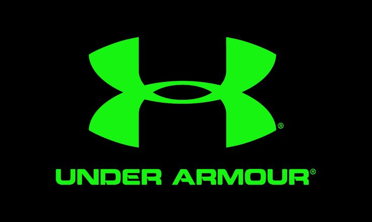
I chose this logo as my "favourite" because maybe with my current bid on getting myself fit and dropping the weight I was naturally attracted to it, so I decided to look closer. The logo appears strong with thick curved lines which widen towards its ends. It gives the impression of someone lifting weights with strong arms and strong legs. The colour is vibrant and again maybe the reason why it jumped out amongst other very well known logos that I had on my screen to pick from. The logo also represents the U and the A with the upper curve cutting the bottom to for the A.
#SHAWGraphic